Are you considering a radical redesign of your website? Then don’t—at least, not until you know what is actually wrong with it.
Why?
Because your regular visitors already know how your website works. They know where the menu sits, how to find information, and which steps they need to take to complete an action. Over time, these interactions become familiar and almost automatic.
This behavior reflects the familiarity principle: people generally prefer interfaces and interaction patterns they already understand.
So, if you suddenly change your website’s navigation, terminology, page structure, and functionality all at once, returning visitors may have to relearn how to use it.
Consequence: Confusion. Abandoned journeys. Lower conversions. And, in extreme cases, loss of users.
Remember Digg? Its radical 2010 redesign changed the experience users had grown accustomed to and is still cited as a warning against ignoring established user behavior.
Don’t get me wrong! I am not entirely against redesigns.
Incidentally, Goodfirms’ website has also undergone high-level overhauls. Significant changes were made across development, design, visuals, and content—and not without good reason.
A complete website redesign can be a game-changer when confusing navigation, weak conversions, poor mobile usability, accessibility issues, or an outdated content structure affect the entire website.
Similarly, a complete rebuild may be unavoidable when the existing CMS, codebase, security, or integrations can no longer support the business.
But what if the website’s foundation still works and only its content, visuals, calls to action, or individual page experiences require improvement?
In that case, a website refresh could be good enough.
My point?
Don’t redesign a website merely because it looks old. And don’t settle for a cosmetic refresh when deeper structural or technical problems are hurting the business.
Start by identifying the actual problem. Then determine whether your website needs a refresh, a redesign, or a complete rebuild.
Confused about whether your website needs a refresh, redesign, or complete rebuild? Consult one of the top web design companies listed on Goodfirms to evaluate your website and determine the right approach.
Website Refresh vs. Redesign vs. Rebuild
A website refresh, redesign, and rebuild are not the same thing.
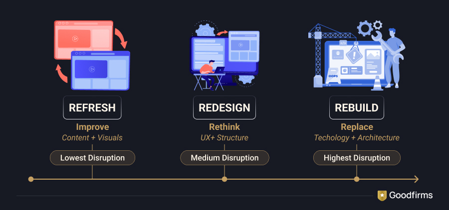
While a refresh improves selected elements of an existing website, a redesign rethinks the overall website experience. A rebuild goes a step further by replacing or substantially re-engineering the technology behind the site.
How?
In the case of a website refresh, the site’s core structure, CMS, and functionality usually remain intact. Designers and content teams may update colors, typography, images, copy, calls to action, and individual page layouts.
In the case of a redesign, almost everything related to the user experience may be reconsidered—navigation, information architecture, content hierarchy, visual design, templates, forms, and user journeys.
During a rebuild, the technical foundation is also changed. The business may migrate to a new CMS, replace an unsupported framework, rebuild integrations, rewrite the front end, or move to a more scalable architecture.
Here’s a quick comparison:
| Factor | Website refresh | Website redesign | Website rebuild |
|---|---|---|---|
| Primary objective | Improve selected elements | Rethink the overall experience | Replace the technical foundation |
| Visual design | Updated | Significantly changed | Completely reconsidered |
| Site structure | Mostly retained | Frequently reorganized | Rebuilt |
| Navigation | Minor adjustments | Restructured | Re-engineered |
| CMS or platform | Usually retained | May be retained or changed | Commonly replaced |
| Functionality | Minor improvements | Major changes or additions | Newly developed or integrated |
| Content | Selectively updated | Audited and restructured | Migrated, consolidated, or rewritten |
| Relative timeline | Shortest | Moderate to long | Longest |
| SEO risk | Low to moderate | Moderate to high | Highest |
| Best suited for | A fundamentally sound website | Systemic UX and content problems | Obsolete or limiting technology |
Still trying to figure out which approach to choose?
Let’s dive into the signs.
A Full-Fledged Website Redesign Should Be on the Cards in the Following Cases
A redesign is the best way forward when the website’s problems are not limited to a handful of pages or visual elements.
1. If Your Website Is Not Consistently Responsive
I cannot stress the importance of a responsive website enough.
Users access websites using different screen sizes, browsers, orientations, and input methods. A page that works well on a laptop may still be difficult to use on a phone or tablet.
And no, hiding desktop navigation behind a hamburger menu does not automatically make a website mobile-friendly.
Check whether:
- Text remains readable without zooming
- Buttons and links are easy to tap
- Forms are comfortable to complete
- Tables and images work on smaller screens
- Important content remains consistent
- Navigation works with touch and keyboards
- Interactive elements do not overlap
- Users can complete essential tasks on mobile
Google primarily uses the mobile version of a website’s content for indexing. Important content, metadata, structured data, and internal links should therefore remain consistent across mobile and desktop experiences.
Consider Goodfirms: A Practical Example of Responsive Design
The Goodfirms desktop website includes menus and information that need to be presented differently on smaller screens. On mobile, navigation is condensed, buttons are optimized for tapping, and information is reorganized to make the experience easier to manage.
The practical takeaway here is that your mobile website should not simply be a squeezed version of your desktop website.
However, if only a few templates have mobile problems, you may not need a complete redesign. If poor responsiveness affects the entire design system, navigation, forms, and content structure, a redesign should certainly be on your radar.
2. If Your Website Is Not Responsive Across Devices and Browsers
As it turns out, Craigslist, one of the most highly trafficked websites in the world, still swears by an ultra-basic, bare-bones design approach.
For years, the company has played it safe, defying changing design trends and remaining faithful to the familiarity principle. The simple interface has become part of its brand identity, making the site immediately recognizable.
But can every business afford to take the Craigslist route?
Certainly not.
Your website does not have to follow every new design trend, but it should still work reliably across modern browsers, devices, and assistive technologies.
Use real devices and browser-testing tools to review:
- Navigation and menus
- Forms and validation messages
- Images, videos, and interactive elements
- Checkout and account journeys
- Font rendering
- Keyboard accessibility
- Screen-reader compatibility
- Landscape and portrait layouts
My point?
Familiarity should not become an excuse for poor usability.
3. If Your Competitors Are Crushing You
There’s more to competitor research than meets the eye.
If you are groping in the dark and need clarity on your next step, examine what your competitors are doing.
Nope, I am not asking you to copy them blindly.
It is about understanding how market expectations have changed and whether your website still gives users enough reason to choose you.
Some questions you can ask are:
- Is your competitor’s website easier to use?
- Does it explain services more clearly?
- Does it load faster?
- Is important information easier to find?
- Does it provide stronger proof through reviews, case studies, or customer stories?
- Is it more visible in organic search?
- Does it make the next step obvious?
- What features or content do customers appear to value?
Finding answers to these questions can help you understand your audience and align your website with their expectations.
However, a competitor’s attractive new website is not, by itself, a reason to redesign yours. The decision should be based on customer needs and business performance—not design envy.
4. If Your Site’s Navigation Is Confusing Users
Site navigation shouldn’t be something web designers experiment with merely to appear different.
Why?
Because visitors arrive with existing expectations about how navigation works. They expect important options to be visible, labels to be understandable, and pages to be organized logically.
Remember the familiarity principle?
Consider Zara.
Zara’s website has often experimented with a magazine-style visual experience. The approach may look striking, but strong visuals can sometimes compete with straightforward product discovery.
If users have to work too hard to find product categories, search, account options, or the shopping cart, the design begins to interfere with the website’s primary purpose.
That doesn’t mean every website must use an identical horizontal menu. A mega menu, compact menu, sidebar, or another navigation pattern may work well depending on the site’s size and audience.
What matters is whether users can predict where information lives.
Here are a few ways to improve website navigation:
- Use descriptive labels instead of vague company language
- Give the most important destinations appropriate prominence
- Avoid excessively deep navigation
- Keep navigation behavior consistent
- Ensure menus work with keyboards and assistive technology
- Use crawlable HTML links for important destinations
- Test navigation against real user tasks
- Review internal search data to see what visitors cannot find
If the problem is limited to a few labels, a refresh may be enough.
If the entire information architecture no longer reflects the business, it is redesign time.
5. If Your Site Does Not Follow Accessibility Guidelines
An accessible website is one that people with different visual, auditory, motor, and cognitive abilities can use.
Accessibility is not limited to adding alternative text to images. Nor can it be solved by choosing one supposedly accessible color combination.
A website accessibility review should cover:
- Keyboard-friendly navigation
- Visible focus indicators
- Sufficient color contrast
- Descriptive links and buttons
- Proper form labels
- Clear instructions and error messages
- Logical heading hierarchies
- Alternative text for meaningful images
- Captions and transcripts for videos
- Adequate target sizes
- Screen-reader compatibility
WCAG 2.2 should serve as the current reference point when reviewing accessibility requirements.
If accessibility issues are isolated—perhaps a few images lack descriptions or individual pages have poor heading structures—a refresh may address them.
But if inaccessible patterns are built into menus, forms, templates, and interactive components, a complete redesign may be necessary.
6. If Important User Journeys Are Failing
Your website may look good and still fail users at crucial moments.
Maybe visitors cannot complete a form. Maybe they abandon checkout. Maybe they repeatedly contact customer support for information that already exists somewhere on the site.
Look for patterns such as:
- Low completion rates across important forms
- Repeated abandonment at the same step
- Poor conversion across several landing-page templates
- Difficulty finding products, services, or pricing
- Confusing checkout or registration processes
- Frequent support queries about website tasks
One weak landing page may only need a refresh.
The same problem appearing across multiple templates, funnels, and user journeys points toward a redesign. Businesses can compare specialized web design companies based on their portfolios, client reviews, industry experience, and service expertise.
When Does Your Website Need a Complete Rebuild?
Sometimes, the website’s appearance and user experience are not the only problems.
The technology itself may be standing in the way.
1. If the CMS or Framework Is No Longer Supported
If WordPress is still the right platform but the existing implementation is creating security, performance, or scalability problems, experienced WordPress development companies can assess whether the site needs targeted redevelopment or a complete rebuild.
2. If Routine Changes Require Developer Support
Does your marketing team need a developer to change a heading, publish a case study, update a service page, or create a landing page?
If yes, the existing content-management system may no longer be serving the business.
A rebuild can give internal teams more control, provided the new system is planned around real publishing workflows.
3. If the Platform Cannot Support Essential Features
Your business may now require:
- New ecommerce capabilities
- Customer accounts
- Advanced search
- Multilingual content
- Personalization
- CRM or ERP integrations
- Marketing automation
- Customer portals
- Complex product or service filters
If these features can only be introduced through fragile workarounds, a rebuild may be more sensible than continuing to patch the old platform.
4. If Security and Maintenance Risks Are Increasing
Outdated plugins, unsupported dependencies, undocumented custom code, and repeated compatibility problems can turn routine maintenance into a recurring emergency.
Mind you, rebuilding does not automatically eliminate technical debt. The new platform must still be properly documented, secured, tested, and maintained.
5. If Performance Cannot Be Fixed Within the Existing Architecture
A refresh can resolve many performance problems. Heavy images, unused scripts, excessive plugins, poor caching, and slow fonts can often be addressed without starting over.
But what if repeated optimization efforts produce only marginal improvements?
In that case, compare the long-term cost of continued patchwork with the cost of rebuilding the platform properly.
A Website Refresh Should Be on the Cards in the Following Cases
Unlike a redesign or rebuild, a website refresh does not significantly change the core architecture.
You can think of it as part of the ongoing maintenance businesses undertake to keep their websites accurate, useful, and relevant.
1. If Your Website Increases Users’ Cognitive Load
Whenever users visit a website, they process information through their working memory.
But what if the information is complicated, cluttered, or overwhelming?
In that case, the website increases their cognitive load—the mental effort required to understand information and make decisions.
Sure thing, some cognitive effort is unavoidable. But designers, developers, and content strategists should do their best to minimize unnecessary effort.
Here are a few ways to reduce cognitive load:
- Remove redundant links and irrelevant images
- Use familiar labels and interaction patterns
- Break long content into meaningful sections
- Present related information together
- Reduce unnecessary choices
- Use sensible defaults
- Make the primary action clear
- Replace complex explanations with diagrams or examples when appropriate
If the problem occurs on a few important pages, refresh those pages first.
2. If Your Website Doesn’t Accurately Reflect Your Brand Story
It’s not uncommon for businesses to shift their focus.
A company may introduce new services, enter new markets, change its positioning, or focus on a different audience.
Your website should reflect these changes and correctly position the business in the marketplace.
Even if your products and services have not changed, it is worth asking whether the story still reflects your vision, values, and customer priorities.
Here are a few ways to improve the brand story:
- Clearly explain what the business stands for
- Focus less on company-speak and more on customer concerns
- Show how your services solve actual problems
- Use testimonials, case studies, and customer stories
- Keep the story focused
- Use content formats that support different stages of the buyer journey
- Give visitors a clear next step
The writer in me still believes in the power of stories.
But storytelling and data should not be treated as enemies. The strongest websites use both: stories to create meaning and evidence to build confidence.
3. If Your Website Lacks User Engagement
When visitors land on your website, they want to understand whether the business is relevant to them.
That does not mean every website needs contests, pop-ups, chatbots, videos, social-media plugins, and half a dozen other interactive features.
More interaction does not automatically mean more engagement.
Start with the basics:
- Make the central message direct and simple
- Provide useful content
- Give prominence to proof
- Make calls to action clear
- Offer assistance where visitors genuinely need it
- Personalize communication only when the data and context justify it
- Reduce unnecessary friction
- Ensure interactive features do not slow down the website
AI chatbots, live chat, co-browsing, and video support can improve engagement in the right setting. But they should solve a real visitor problem—not merely decorate the website.
4. If Your Website’s Loading Speed Is Not Good Enough
It goes without saying: website speed influences user experience and can affect business performance.
But don’t focus on one dramatic bounce-rate statistic or one laboratory score.
Instead, examine real-user data alongside controlled tests.
Current Core Web Vitals include:
- Largest Contentful Paint: Measures loading performance
- Interaction to Next Paint: Measures responsiveness
- Cumulative Layout Shift: Measures visual stability
To improve website performance:
- Optimize and properly size images
- Use modern image formats where appropriate
- Remove unnecessary scripts
- Review third-party tags
- Minify CSS and JavaScript
- Improve caching
- Use a content delivery network where useful
- Optimize font delivery
- Improve hosting when server response is a problem
- Remove unused plugins and extensions
- Avoid unnecessary redirect chains
Also, test important templates separately. A fast homepage does not guarantee that product, checkout, account, or service pages perform well.
If these improvements can be made within the existing architecture, a refresh should be good enough.
If the architecture itself is the bottleneck, think about a rebuild.
5. If Customers Cannot Find the Information They Need
Customer experience makes or breaks a website.
Despite knowing this, many businesses learn about poor experiences only after customers complain. Until then, the damage may already be underway.
So, leave your ivory tower and engage with customers in the trenches.
Ask them:
- Did you find the information you were looking for?
- Was it easy to locate?
- Did the page answer your questions?
- Was anything confusing or missing?
- Could you complete the intended action?
- What almost stopped you?
Compare this feedback with analytics, internal-search data, form completion, and customer-support queries.
Are visitors abandoning a journey halfway through? Are they repeatedly searching for information that should be visible? Are certain pages receiving traffic but failing to generate action?
These answers will show whether you need a focused refresh or a broader redesign.
6. If Your Website Focuses Only on Product Information
Product specifications and service details are important.
But dry, technical information alone may not help customers understand why the product matters or how it fits their situation.
This is where storytelling comes in.
Use a mix of:
- Customer stories
- Case studies
- Product demonstrations
- Founder or company stories
- Testimonials
- Data and research
- How-to content
- Comparison pages
- Videos and visual explanations
My point?
Use stories to make information relatable and data to make it credible.
7. If Your Website Content Is Outdated
Website content is what draws visitors, answers questions, and supports decisions.
That means it needs regular attention.
But frequent updating does not mean changing content merely to display a new date.
Update content when:
- Products or services change
- Statistics become outdated
- Links or tools stop working
- Customer questions evolve
- Search intent changes
- Regulations or technical guidance change
- New evidence becomes available
- Competitors or market conditions alter the decision
Keep accurate pages that continue to serve users. Refresh pages where the information or search intent has materially changed.
8. If Your Site Enforces Compulsory Registration During Checkout
Placing a “Create an account” requirement at the beginning of checkout can create unnecessary friction.
Potential customers may see registration as an obstacle and abandon the purchase.
Instead, consider offering guest checkout and introducing optional account creation after the user has made progress—or after the order is complete. Ecommerce businesses facing broader checkout, account, payment, or platform limitations may need support from experienced eCommerce development companies rather than another isolated design fix.
Mind you, account creation may be essential for certain subscriptions, regulated services, or personalized products.
The point is not that registration is always wrong. The point is that every required step should have a clear customer or business purpose.
How Much Does a Website Refresh, Redesign, or Rebuild Cost?
A website refresh generally costs less because it retains the existing platform, structure, and most of the functionality.
A redesign requires more research, strategy, UX work, content planning, design, development, testing, and coordination.
A rebuild is usually the most resource-intensive because it may include platform selection, redevelopment, integrations, data migration, content migration, redirect planning, and infrastructure changes.
But there is no universal price tag.
The total cost depends on:
- Number and complexity of pages
- Number of unique templates
- Custom functionality
- Ecommerce or account features
- Third-party integrations
- Content volume
- Accessibility requirements
- Data and content migration
- Number of languages or markets
- User research and testing
- SEO migration
- Quality assurance
- Post-launch support
So, when comparing agency proposals, don’t compare price alone.
Make sure every proposal covers the same scope. One agency may be quoting for a visual refresh while another assumes a complete rebuild.
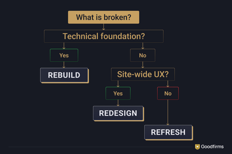
How to Choose Between a Website Refresh, Redesign, and Rebuild
Still scratching your head?
Start with a website audit covering content, analytics, user experience, accessibility, SEO, technology, security, and performance.
Then ask:
- Does the existing platform still meet our technical requirements?
- Can internal teams manage content efficiently?
- Does the navigation reflect our current products and services?
- Can users complete important journeys comfortably?
- Are performance problems isolated or systemic?
- Are accessibility issues limited to individual pages or built into the templates?
- Does the website reflect our current positioning?
- Can necessary functionality be added without fragile workarounds?
- Which pages currently generate traffic, links, leads, or revenue?
- What business result should this project improve?
If the foundation works and the problems are limited, opt for a refresh.
If the technology works but the overall experience does not, opt for a redesign.
If the technology is preventing meaningful progress, opt for a rebuild.
Protect Your SEO During a Website Redesign or Rebuild
A redesigned website may look fantastic and still lose organic visibility if the migration is mishandled. When the project involves redevelopment, CMS migration, or complex integrations, shortlist website development companies with proven experience in technical migration—not merely visual redesign.
Before launch:
- Benchmark organic traffic, rankings, conversions, and backlinks
- Identify high-performing landing pages
- Retain valuable URLs where practical
- Map changed URLs to the closest relevant replacements
- Implement permanent server-side redirects
- Preserve valuable content, metadata, and structured data
- Review internal links
- Check canonical tags and robots directives
- Generate an updated XML sitemap
- Test the staging website
- Check for broken links and redirect chains
After launch:
- Monitor crawling and indexing
- Track rankings and organic landing-page traffic
- Check 404 errors and redirects
- Confirm that analytics and conversions are recorded
- Compare performance with the pre-launch benchmark
- Review important templates across mobile and desktop
Don’t redirect every removed URL to the homepage. Send visitors and search engines to the closest relevant replacement.
And avoid changing the CMS, URLs, navigation, design, and content without a documented migration plan.
Too many uncontrolled changes make post-launch problems extremely difficult to diagnose.
Website Refresh Moves the Needle, While Redesign Proposes a Turnaround
Control what you can and ignore everything else, they say.
If confusing navigation, broken user journeys, inconsistent templates, accessibility problems, and weak conversions affect the entire site, think about redesigning your website.
If an obsolete CMS, fragile codebase, security risk, or technical limitation is holding the business back, a complete rebuild may be the better route.
But if you are dealing with outdated content, tired visuals, individual performance problems, weak calls to action, or selected usability issues, a website refresh should be good enough.
My point?
Don’t begin with, “We need a new website.”
Begin with, “What problem are we trying to solve?”
Once the problem is clear, choosing between a website refresh, redesign, and rebuild becomes considerably easier.
What’s your take on website refresh vs. redesign vs. rebuild? Have I missed out on any critical points? Let us know!
Frequently Asked Questions
What is the difference between a website refresh and a redesign?
A website refresh improves selected elements such as content, visuals, calls to action, and individual layouts while retaining the core structure and platform. A redesign makes coordinated changes to navigation, user journeys, content structure, templates, and visual identity.
What is the difference between a website redesign and a rebuild?
A redesign primarily changes how the website looks, communicates, and works for users. A rebuild replaces or substantially re-engineers its technical foundation. Some projects combine both, but they should be scoped separately.
How often should a website be redesigned?
There is no fixed redesign cycle that applies to every business. Redesign a website when evidence shows that its structure, experience, branding, or functionality no longer supports user and business requirements—not simply because a certain number of years has passed.
Can a website refresh improve SEO?
Yes. A refresh may improve SEO when it strengthens content relevance, internal linking, usability, performance, accessibility, and search snippets. Cosmetic changes alone, however, are unlikely to produce a meaningful improvement.
Can a website redesign hurt SEO?
Yes. Organic visibility may decline if valuable content is removed, URLs change without appropriate redirects, internal links are lost, metadata is overwritten, or crawling and indexing controls are misconfigured. SEO migration planning should therefore begin before the redesign is developed.
Should you refresh or redesign a slow website?
It depends on the cause. Heavy images, unnecessary scripts, caching problems, and excessive plugins may be addressed through a refresh. Architectural limitations, obsolete technology, and an inflexible platform may require a rebuild.